BRAND POSITIONING – VISUAL IDENTITY – ART DIRECTION – BRAND GUIDELINES – EXPERIENCE DESIGN
À Table brings the warmth of the French bistrot to Dubai. Conceived as one culinary house with three expressions, it moves from the familiar energy of a neighbourhood bistrot to intimate supper clubs and bespoke culinary experiences. Each has its own atmosphere, but all share the same invitation: come together around the table.
ONE IDENTITY, MANY WAYS TO GATHER
Our challenge was to create a brand that could feel at home in an everyday bistrot and at an elevated dinner. We built a flexible identity around À Table as the master brand, with clear expressions for the Bistrot, Supperclub and Culinary Experiences.
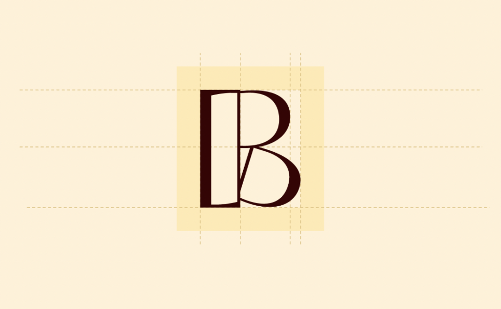
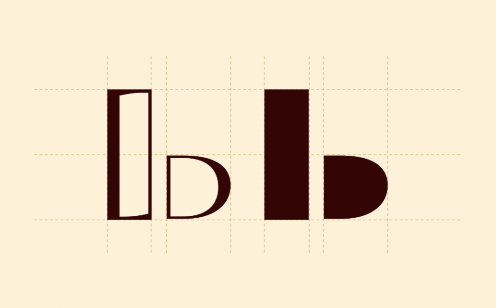
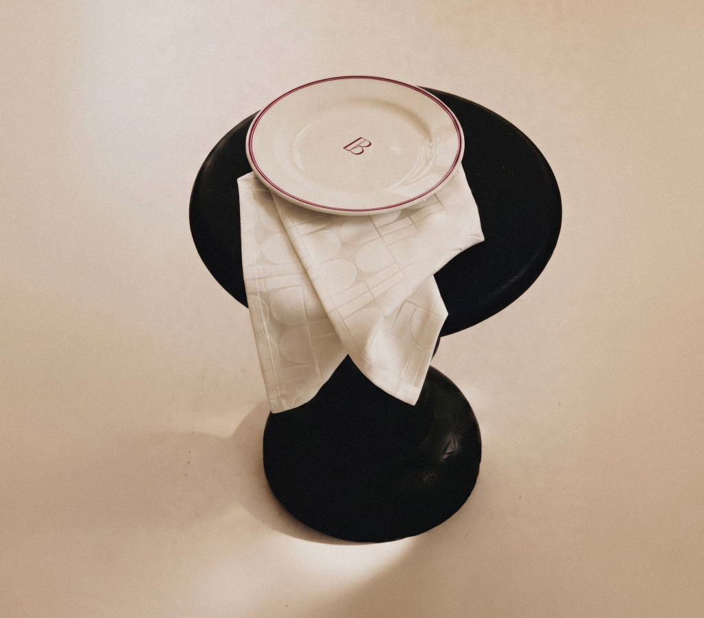
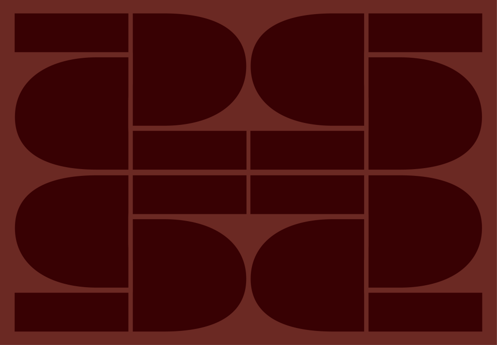
The logotype pairs refined proportions with a distinctive B. That letter became the starting point for a monogram evoking a table framed by two chairs, as well as a set of graphic elements that bring rhythm to menus, objects and spaces.
FRENCH CHARACTER, CONTEMPORARY WARMTH
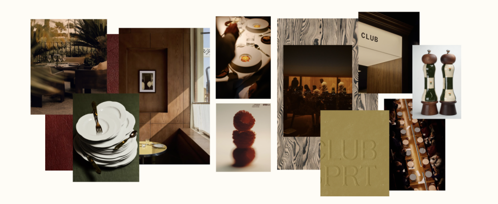
Deep burgundy, warm brown and cream give the identity its welcoming foundation, while brighter accents introduce moments of energy. Expressive editorial typography sits alongside a clear, modern typeface, creating a balance between elegance and ease.
The art direction extends beyond the graphic system. It considers the details that shape a meal: the menu in a guest’s hands, the setting of the table, the light in the room and the gestures of service. Photography moves naturally from lively daytime moments to more intimate evenings.
The result is a recognisable world that adapts to every occasion. Whether guests arrive for a familiar lunch, a supper club or a private event, À Table makes the experience feel personal, generous and worth sharing.