NAMING – LOGO – BRAND IDENTITY – BRAND POSITIONING – PACKAGING DESIGN – SOCIAL MEDIA CONTENT
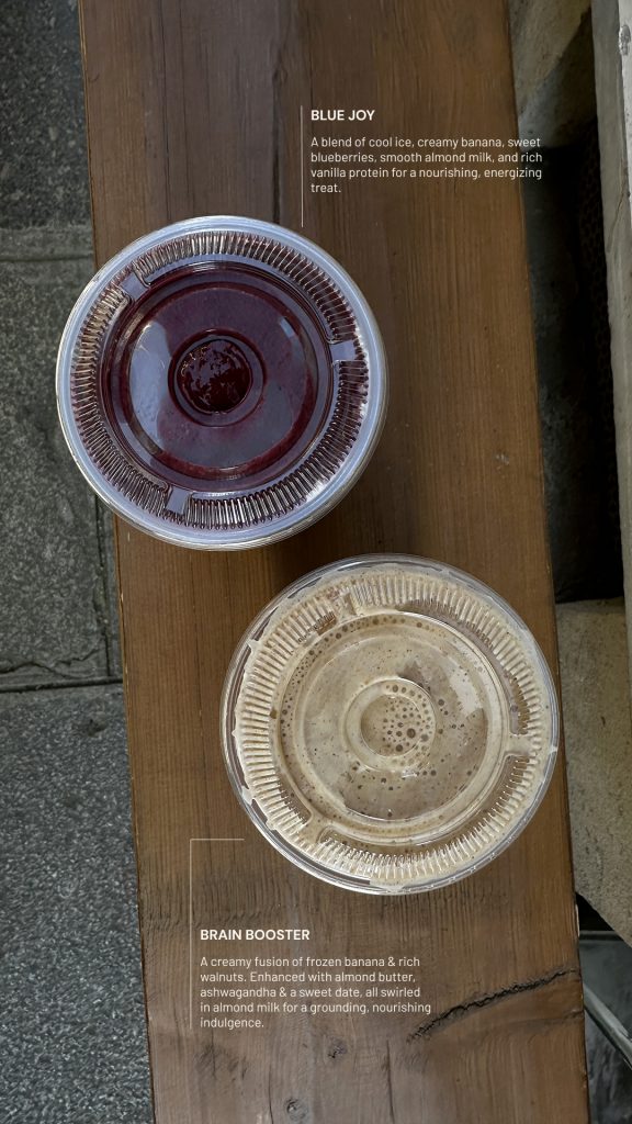
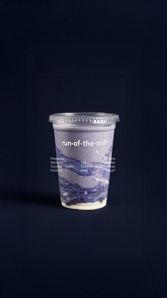
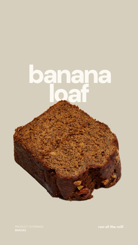
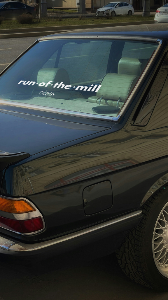
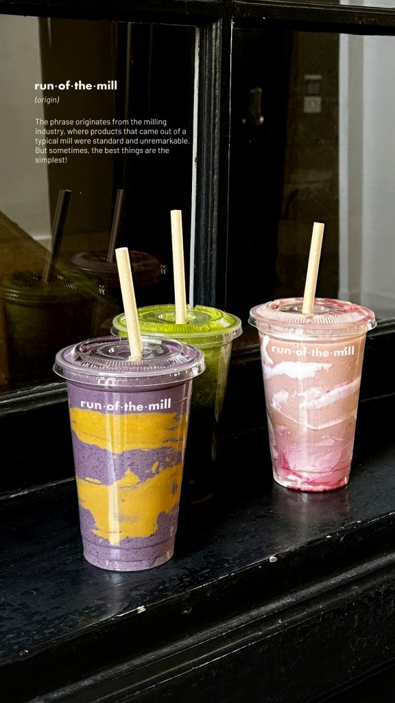
run-of-the-mill is more than just a premium juice bar and coffee shop, it’s a place to live life. Milkshake developed the brand positioning, from the brand name and graphic charter to lifestyle shoots and brand content on the brand’s social media channels.
OUR METHODOLOGY: WE APPROACHED THE REBRANDING OF THE RUN OF THE MILL BRAND FROM A HOLISTIC PERSPECTIVE. WE STARTED BY CREATING A BRAND NAME THAT IS RECOGNIZABLE, DISTINCTIVE, AND ALIGNED WITH THE UNIVERSE THE BRAND AIMS TO EMBODY: PREMIUM SMOOTHIES THAT BECOME AN EVERYDAY DRINK. BECAUSE THE SIMPLEST THINGS ARE OFTEN THE BEST: RUN OF THE MILL.
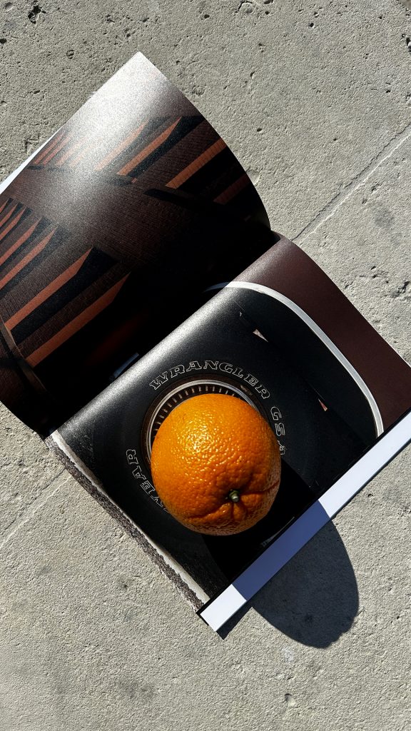
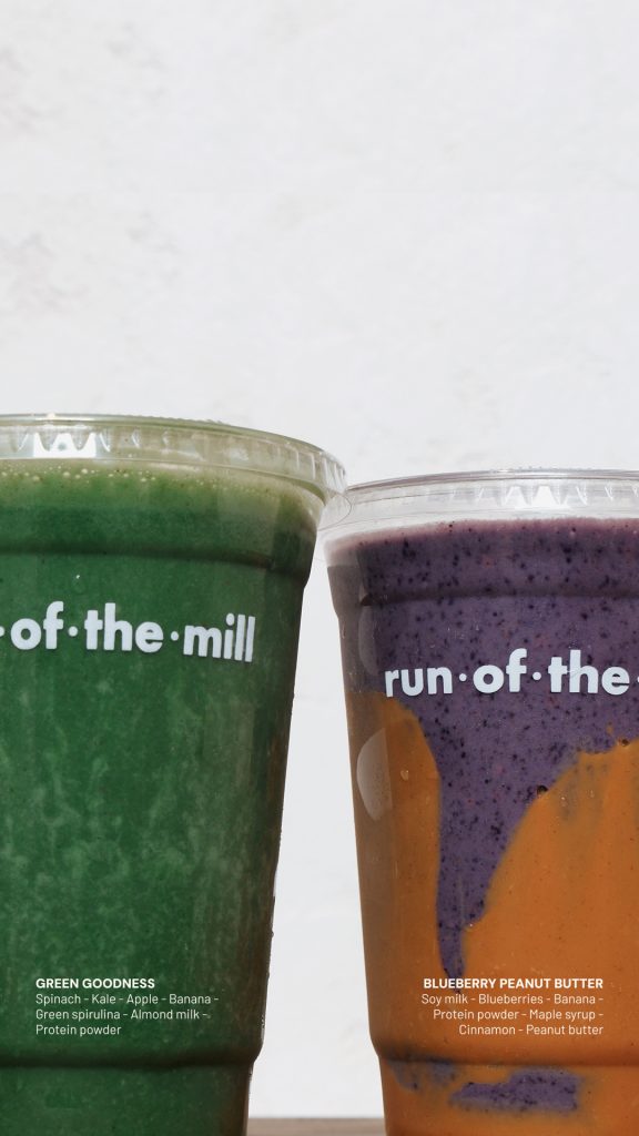
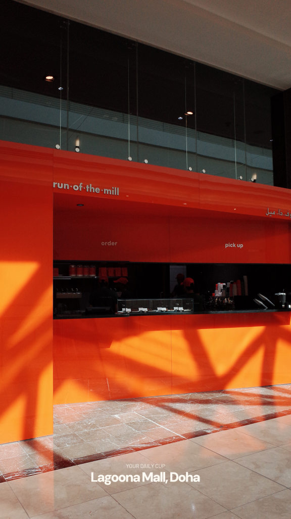
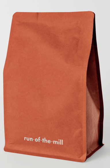
We then developed the art direction, from the logo and color palette to the visual identity across every touchpoint: social media, retail spaces, and packaging. The carrot-orange color was chosen to create an immediate connection with vegetables while also being bold, visible, and memorable.
Works qatar
WORKS
QATAR
+ strategic planning + graphic charter + logo + brand content + social media + shooting + packaging design
+ strategic planning + graphic charter + logo + brand content
+ social media + shooting + packaging design
FROM “DOUBLE JOY” TO “RUN OF THE MILL”
A POWERFUL BRAND EXPRESSION TURNING THE ORDINARY INTO A RECOGNIZABLE SIGNATURE.